


TIDAL PAGES
the challenge
TIDAL PAGES is a San Diego directory and community hub on a mission to close the generational wealth gap. By connecting conscious consumers with BIPOC-owned businesses, they turn everyday local shopping into real social impact, creating “waves of change” across the county.
TIDAL PAGES started out focused on environmental advocacy, then made a big pivot. Their new mission: empower communities of color through an online directory and high-impact community events.
Going from environmentalism to social equity meant speaking to a brand-new audience. They needed a visual identity as vibrant and powerful as the community they serve, one that bridged their coastal roots and their new focus on economic empowerment.

“When our organization needed a new brand for TIDAL PAGES, a new directory of BIPOC businesses in San Diego County, Jess was our natural first choice. She didn't just redesign a logo; she created a beautiful new brand identity that perfectly captured the diversity and "wave of change" we wanted the directory to reflect.”
the approach
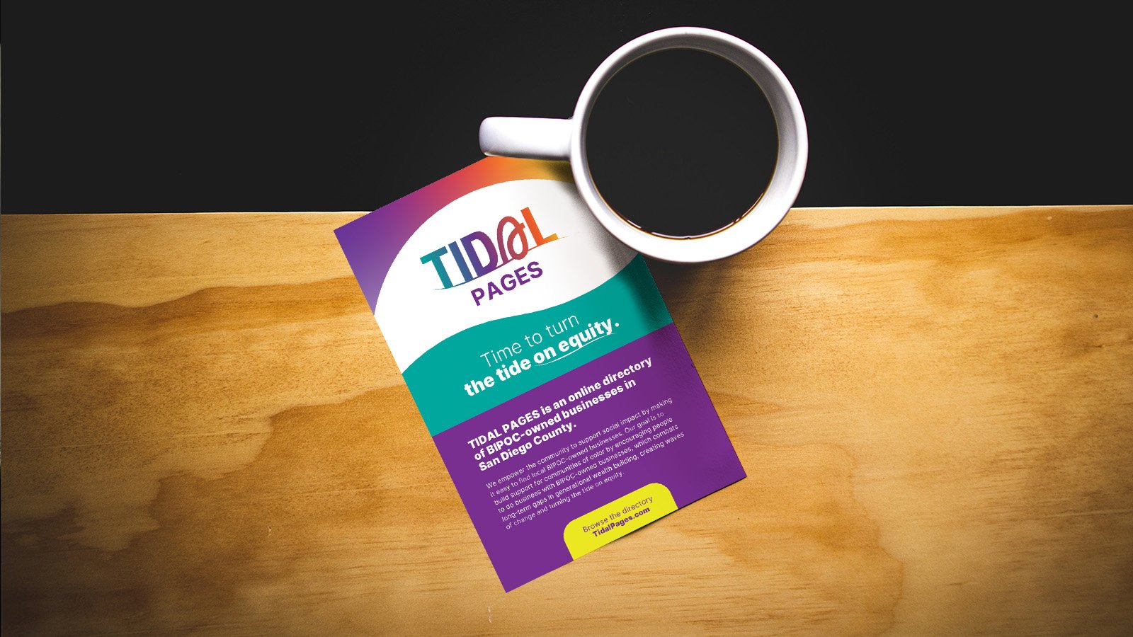
Building on the brand foundation from Axiom of Purpose, I translated TIDAL PAGES’ mission, vision, and values into a cohesive visual identity made for San Diego’s diverse community of entrepreneurs.
The strategy behind the symbols
The “A” icon: Represents forward movement, and how these businesses stand out in a “sea of sameness.”
The wave: A nod to the brand’s name and the transformative power of water, signaling the change TIDAL PAGES is bringing to San Diego.
The gradient: A celebration of diversity. The colorful palette reflects the vibrancy of communities of color, inspired by the warm hues of a San Diego sunset.